Soprize
Client
Soprize
Services
Brand Identity, Art Direction, Brand Development, Motion Design
Year
2026
The Scope:
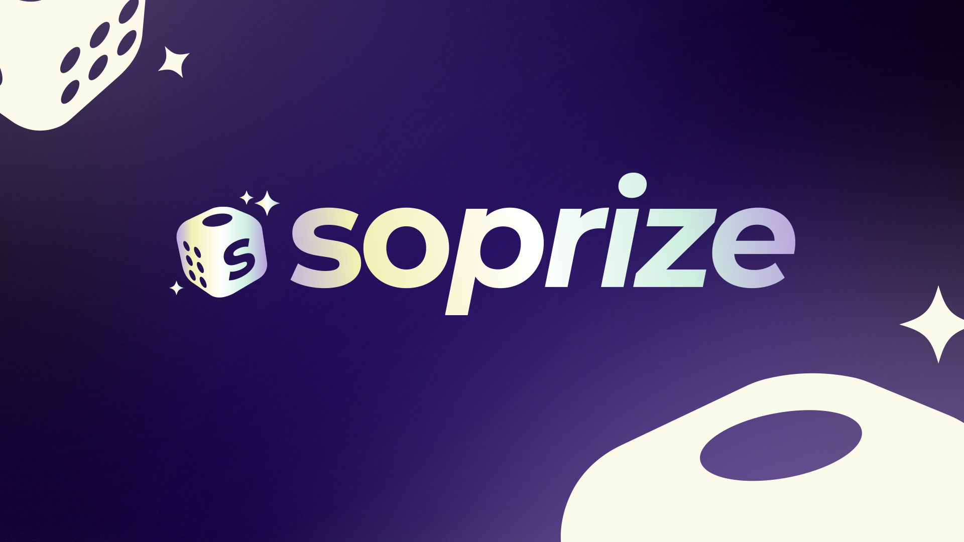
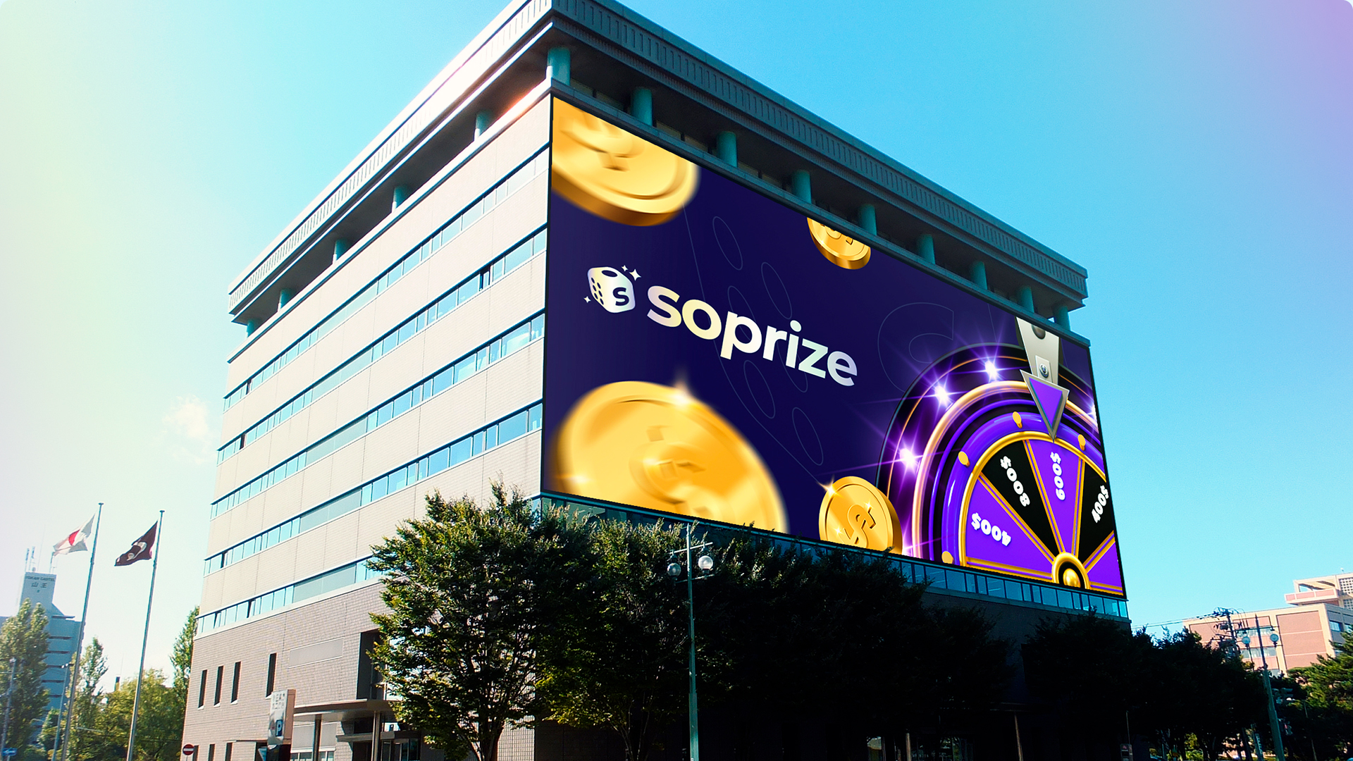
Soprize is a digital ecosystem where Surprise meets Prize. Ciao Creative Lab was commissioned to engineer the brand’s foundational identity, translating this phonetic fusion into a scalable visual architecture. We developed the core brand assets: logo, chromatic system, and typography, establishing the aesthetic framework that governs the entire brand experience.
the brand
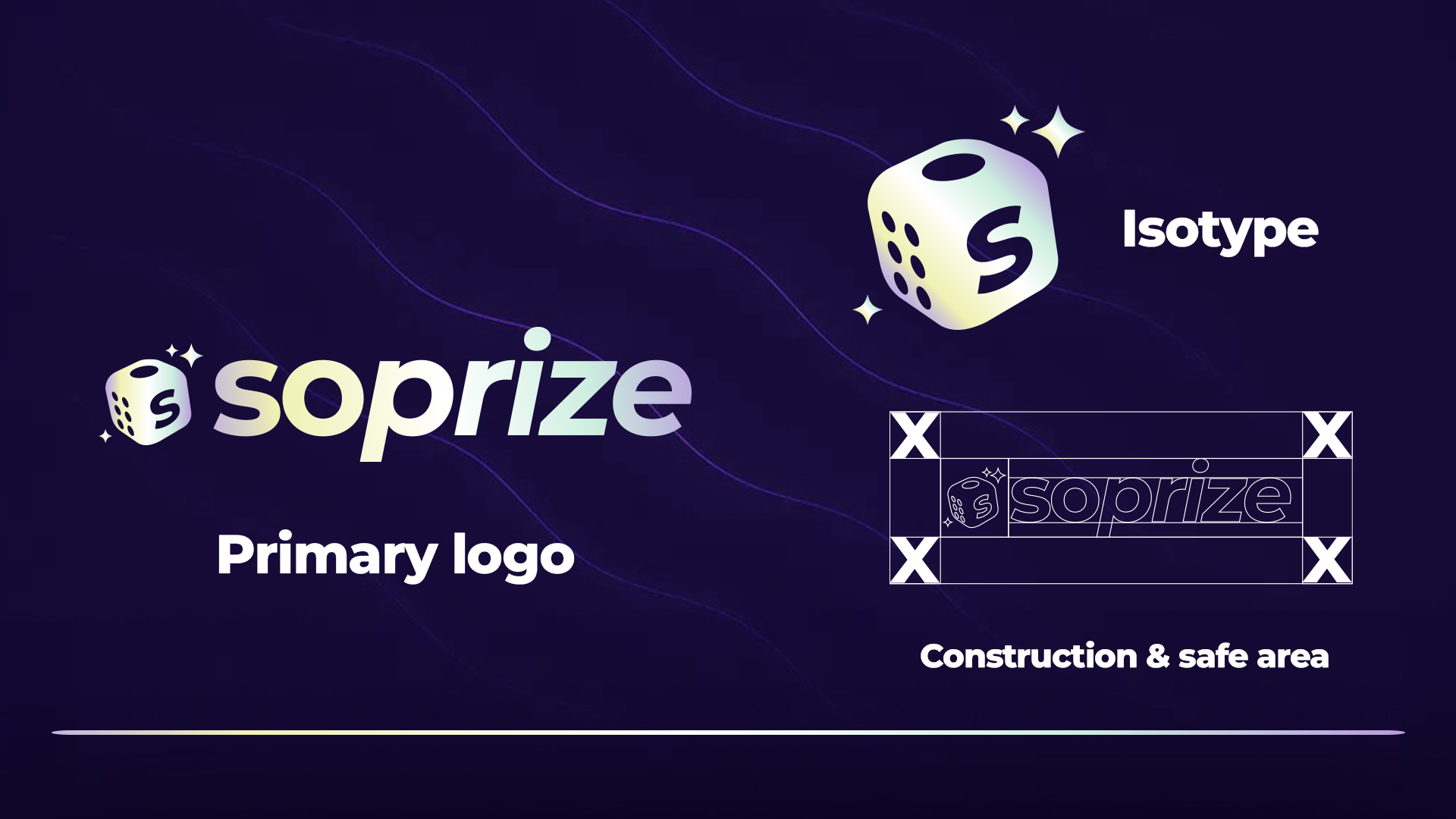
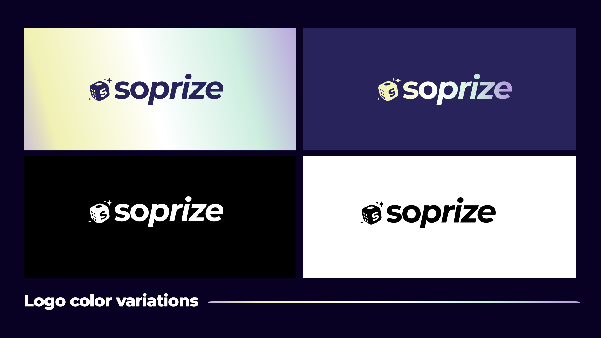
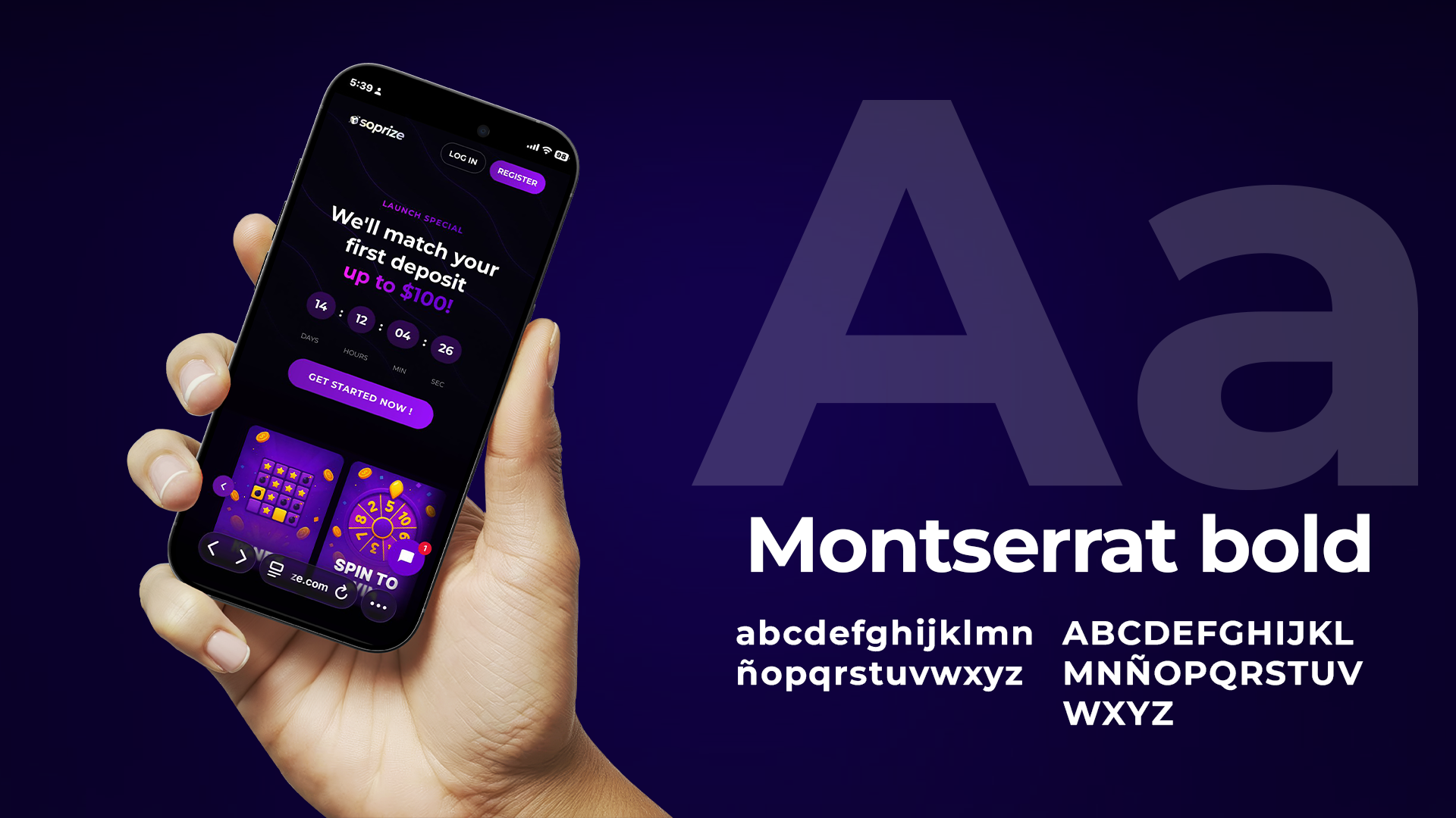
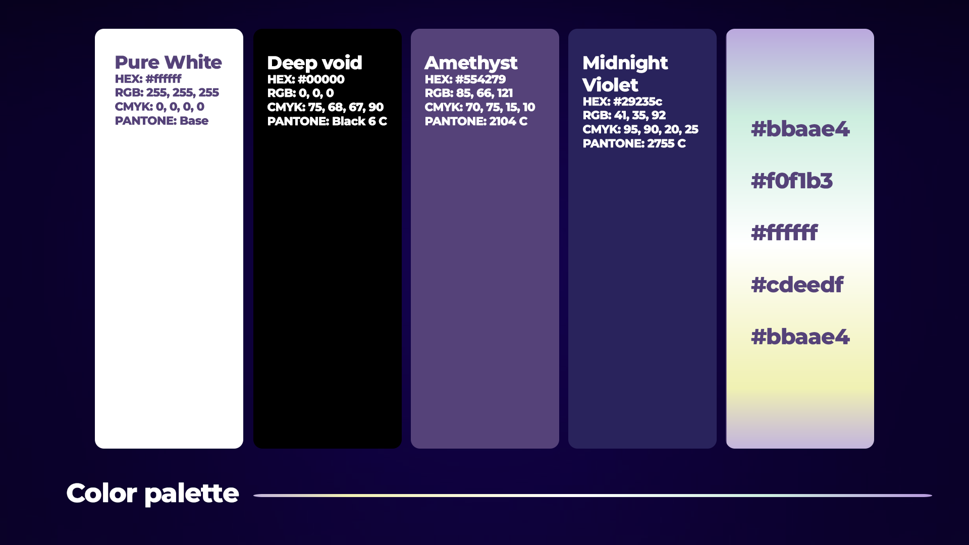
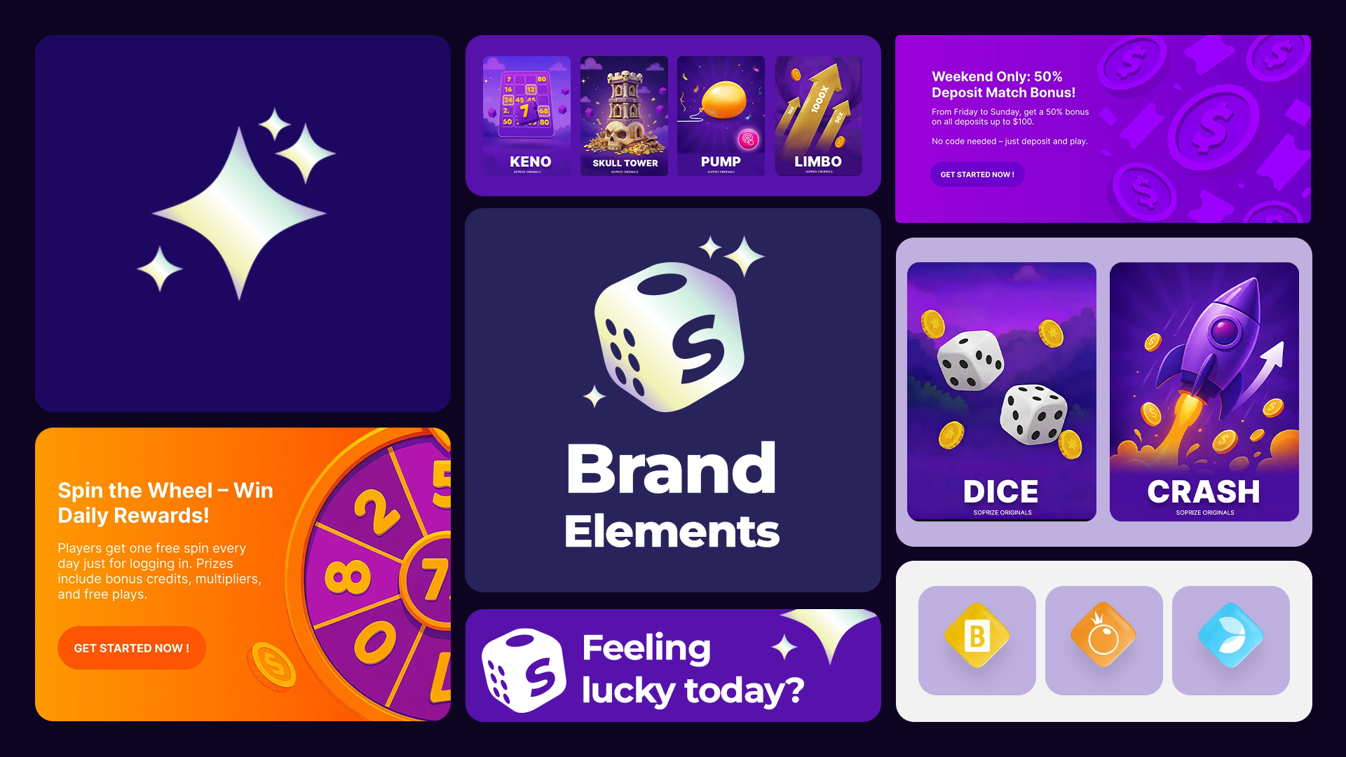
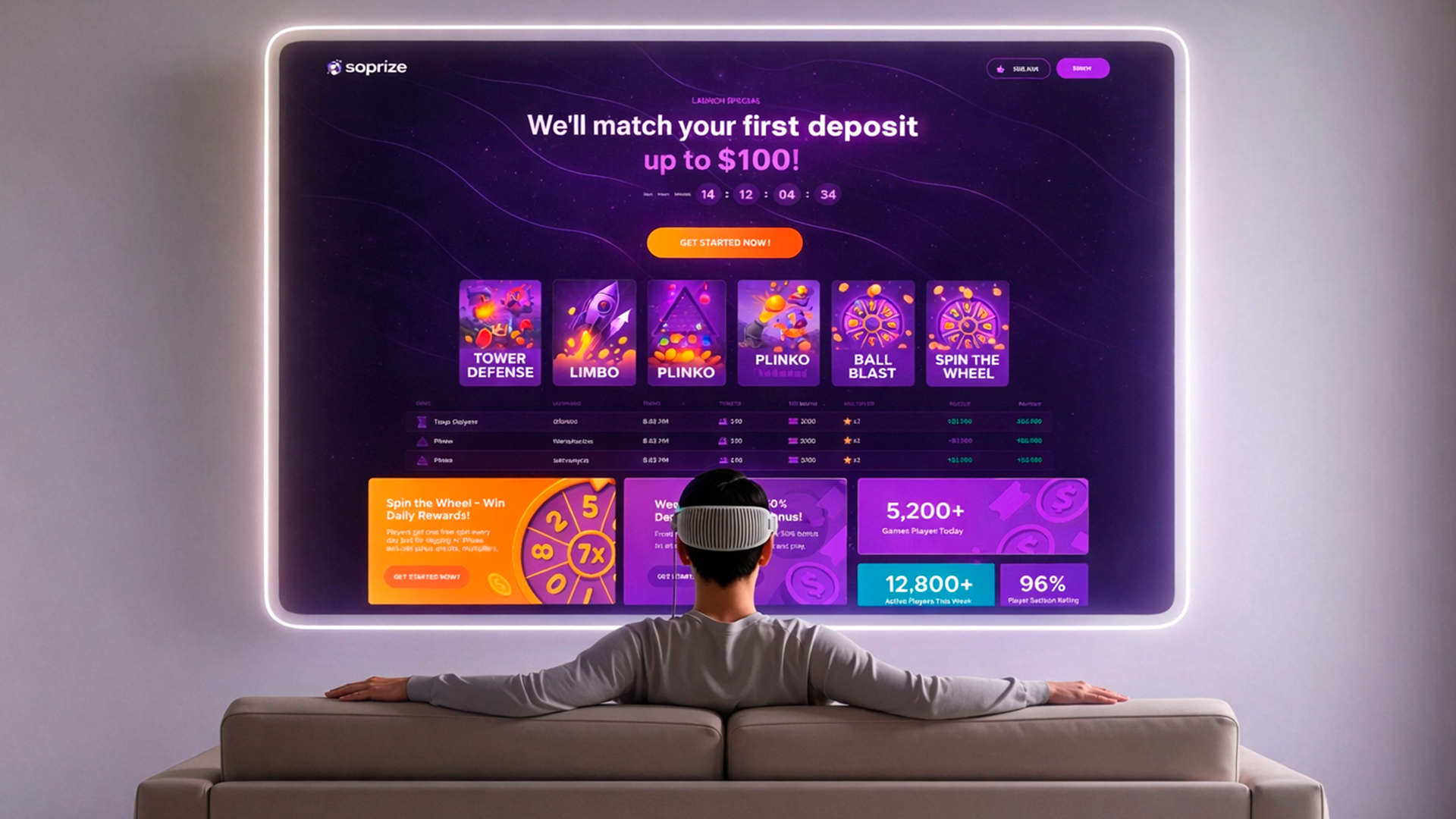
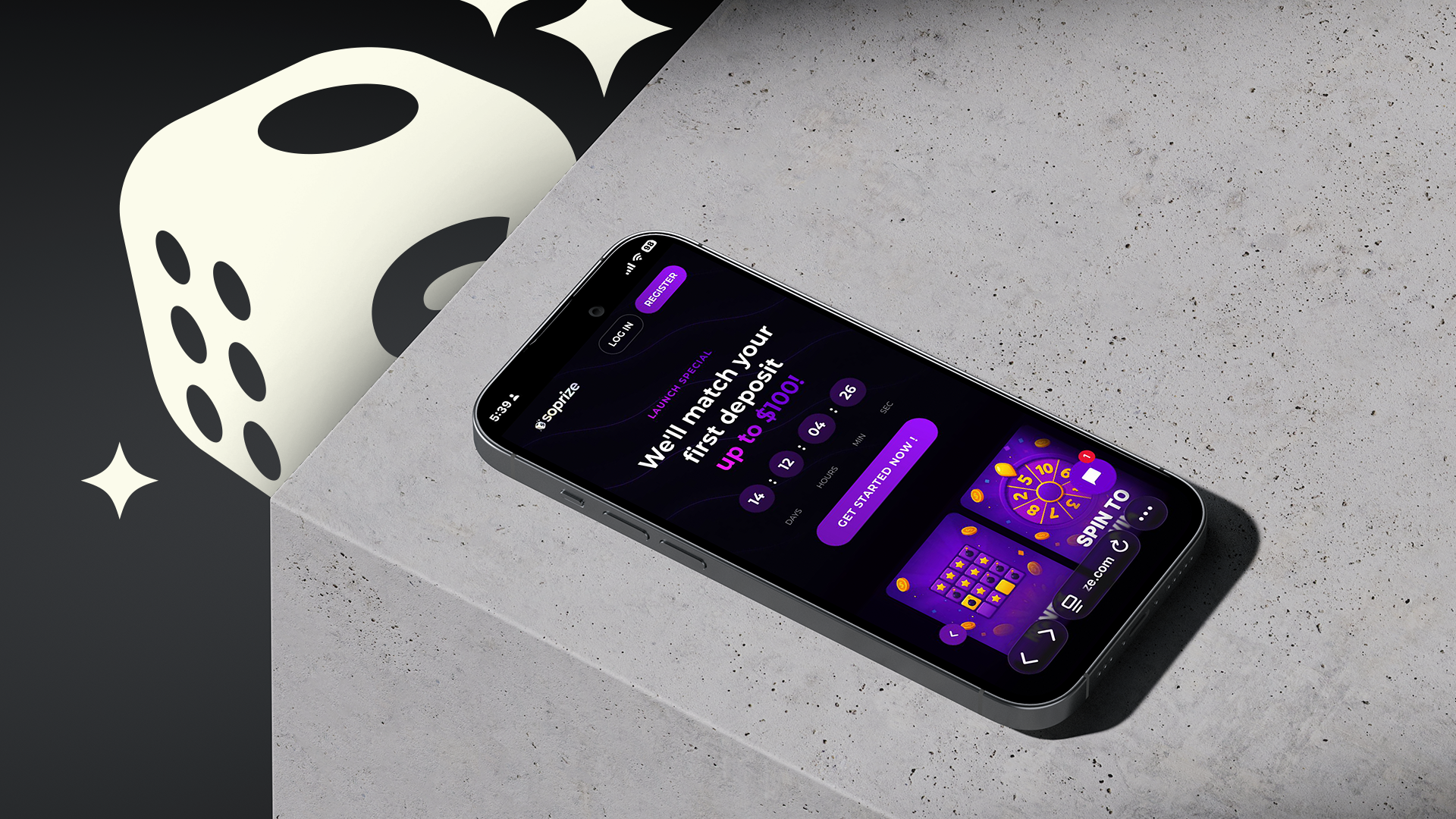
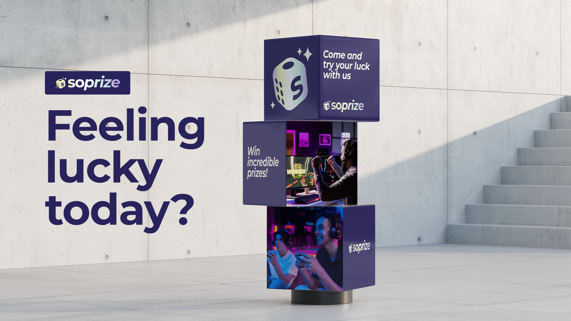
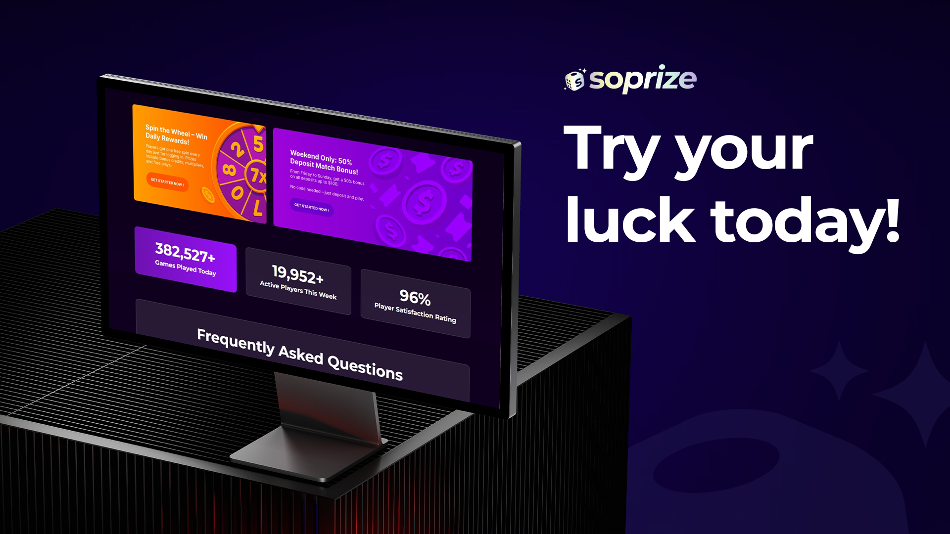
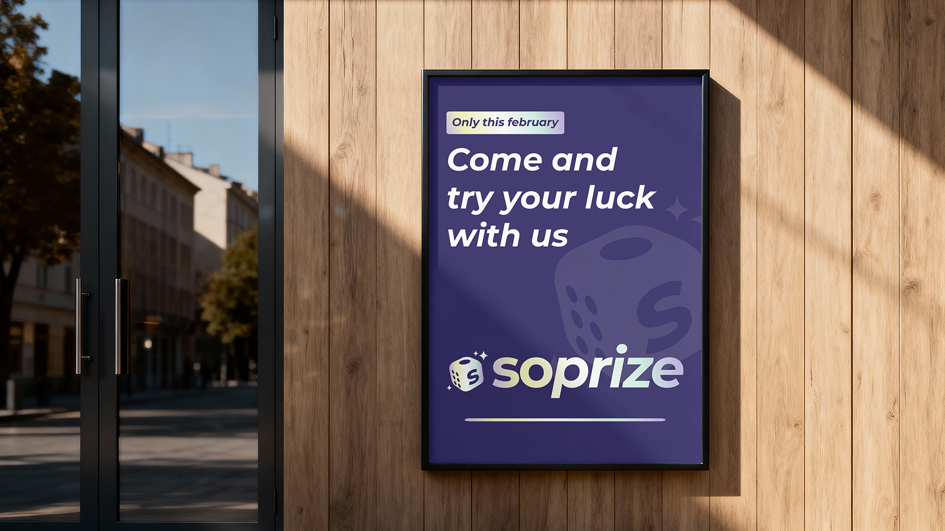
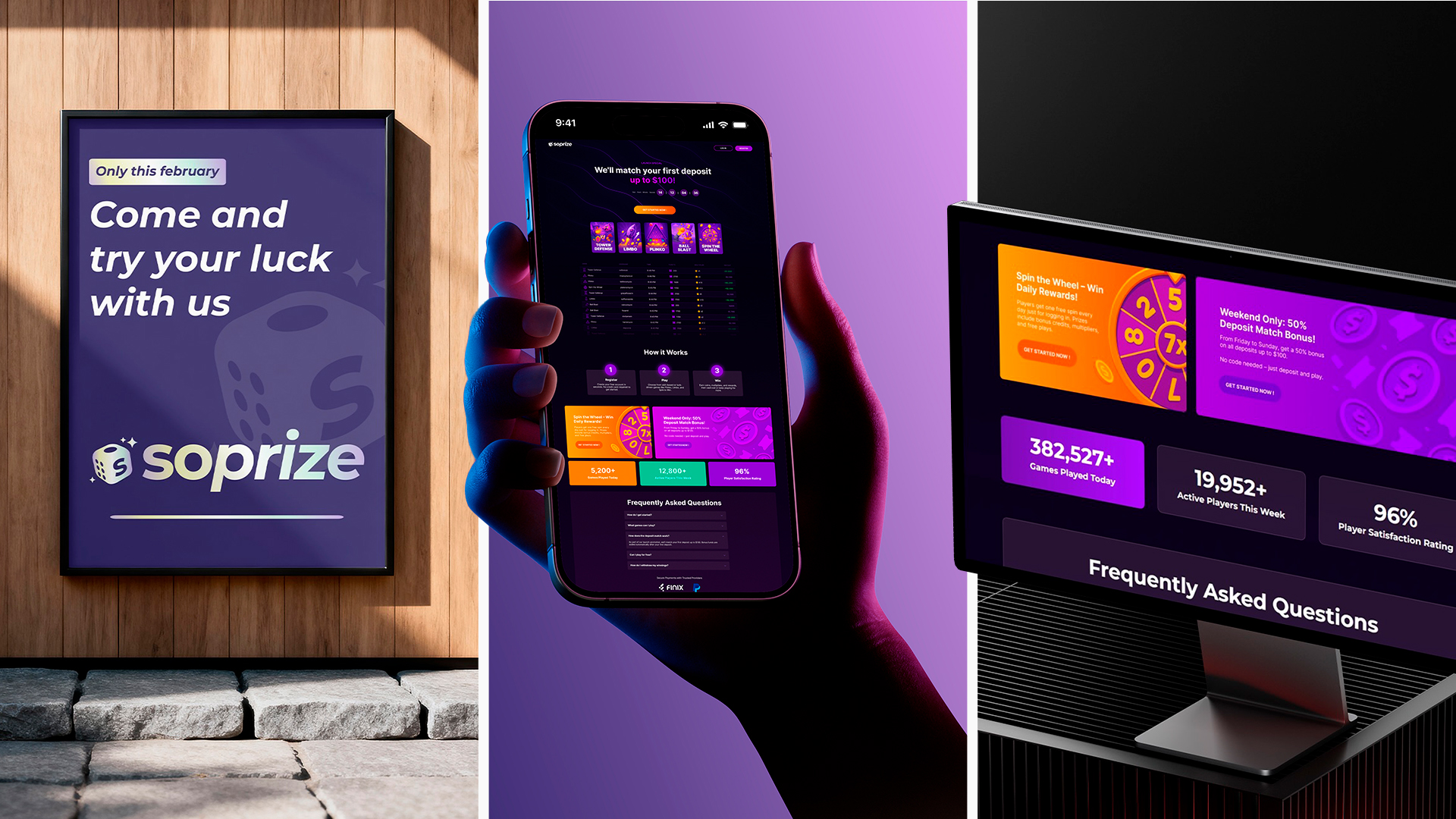
Brand Architecture & Logo: The identity is anchored by a logo that balances geometric precision with the kinetic energy of a reward. The symbol is a minimalist icon designed for the digital economy, optimized for high-speed recognition and functioning as a clear visual anchor within mobile interfaces and notification-heavy environments. Through structural harmony, the mark captures the exact moment of discovery the unboxing using clean, deliberate lines that maintain legibility at any scale, from compact app icons to large format digital displays. Chromatic Dynamics & Typography: Because Soprize operates within the competitive landscape of digital rewards, the visual toolkit was intentionally crafted to command attention through high-impact contrast. The color strategy moves away from conventional tech palettes in favor of a high-energy chromatic system selected to immediately trigger the psychological association with a win, acting as a visual shortcut to the emotional moment of reward. Complementing this, the typographic voice bridges technical reliability with human approachability, ensuring that every communication across platforms maintains a tone that is clear, authoritative, and inviting.
Outcome
Our intervention focused on delivering a robust Brand DNA. We created a comprehensive set of rules and assets that define how the brand lives and breathes. While the digital product continues to evolve through various implementations, the visual foundation established by Ciao provides the necessary consistency and aesthetic rigor to ensure the brand remains recognizable, cohesive, and premium across all future touchpoints. While the platform continues to evolve, the visual DNA we established provides the consistency and emotional resonance needed to turn a simple prize into a true surprise.
More projects
From Execution
Brand Identity, Art Direction, Brand Design, Motion Design

Kick Off – 2025
Art Direction, Brand Design, Motion Graphics