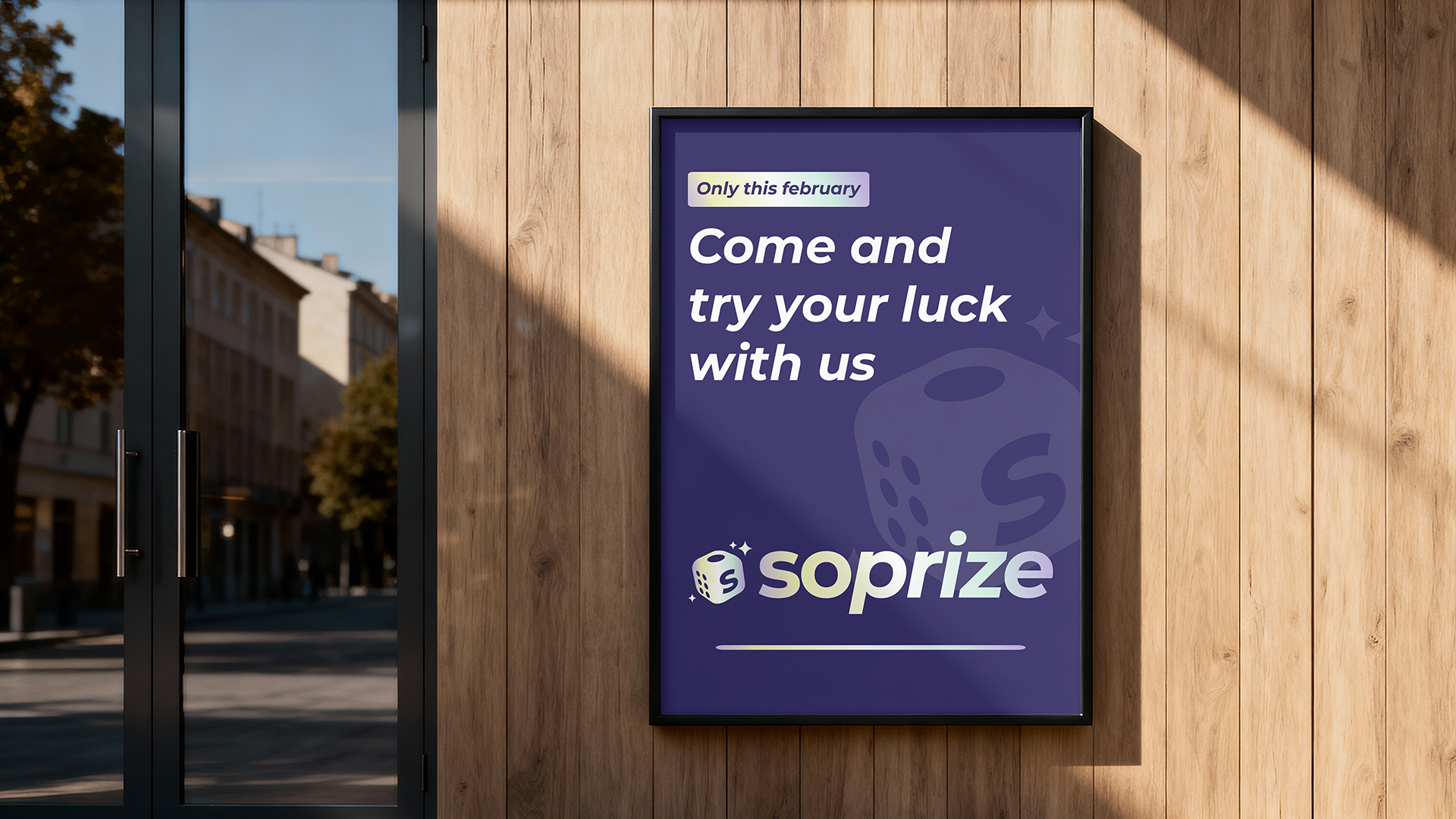
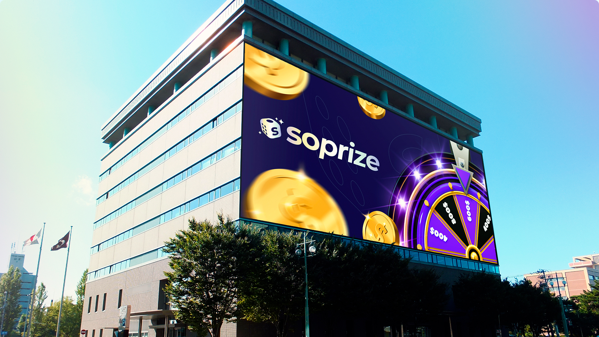
Nike – MIT

Nike – MIT

Client

Nike, Inc. Oregon

Services

Research, Art Direction, Branding, Motion Graphics, Graphic Design

Year

2024

Nike’s MIT (Management Intelligence Tool) stands as a testament to innovation, embodying Nike’s proprietary approach to Business Intelligence. This software’s mission is transforming data from across the globe into actionable insights for strategic decision-making, including accounting, marketing, and sales.

Solution

We built the brand identity by tying into Nike’s roots, using the «Futura» typeface from the historic «You Can Do It» campaign to emphasize continuity and innovation. The visual design incorporated a global map to symbolize the worldwide data MIT manages, bringing a sense of unity to the platform. We highlighted MIT’s capacity to process, transform, and analyze data on a large scale, making it instrumental for strategic decisions across various areas. Nike’s commitment to cutting-edge technology and data was crucial for this branding strategy.

Results

Enhanced Data-Driven Decision-Making: The new platform design improved Nike's ability to leverage global data insights, increasing cross-departmental collaboration. User Engagement: Post-launch, the intuitive interface led to a 35% boost in user engagement across Nike's teams worldwide. Global Brand Integration: The seamless alignment with Nike's iconic branding increased internal recognition of MIT as a central tool, contributing to a rise in platform usage for business strategies.

More projects

Soprize

Brand Identity, Art Direction, Brand Development, Motion Design

Nike – MIT

Client

Soprize

Services

Brand Identity, Art Direction, Brand Development, Motion Design

Year

2026

Soprize: Engineering the «Aha!»

Moment Crafting a High Energy Identity for the Future of Gifting

The Scope

Soprize is a digital ecosystem where Surprise meets Prize. Ciao Creative Lab was commissioned to engineer the brand’s foundational identity, translating this phonetic fusion into a scalable visual architecture. We developed the core brand assets: logo, chromatic system, and typography, establishing the aesthetic framework that governs the entire brand experience.


BRAND ARCHITECTURE

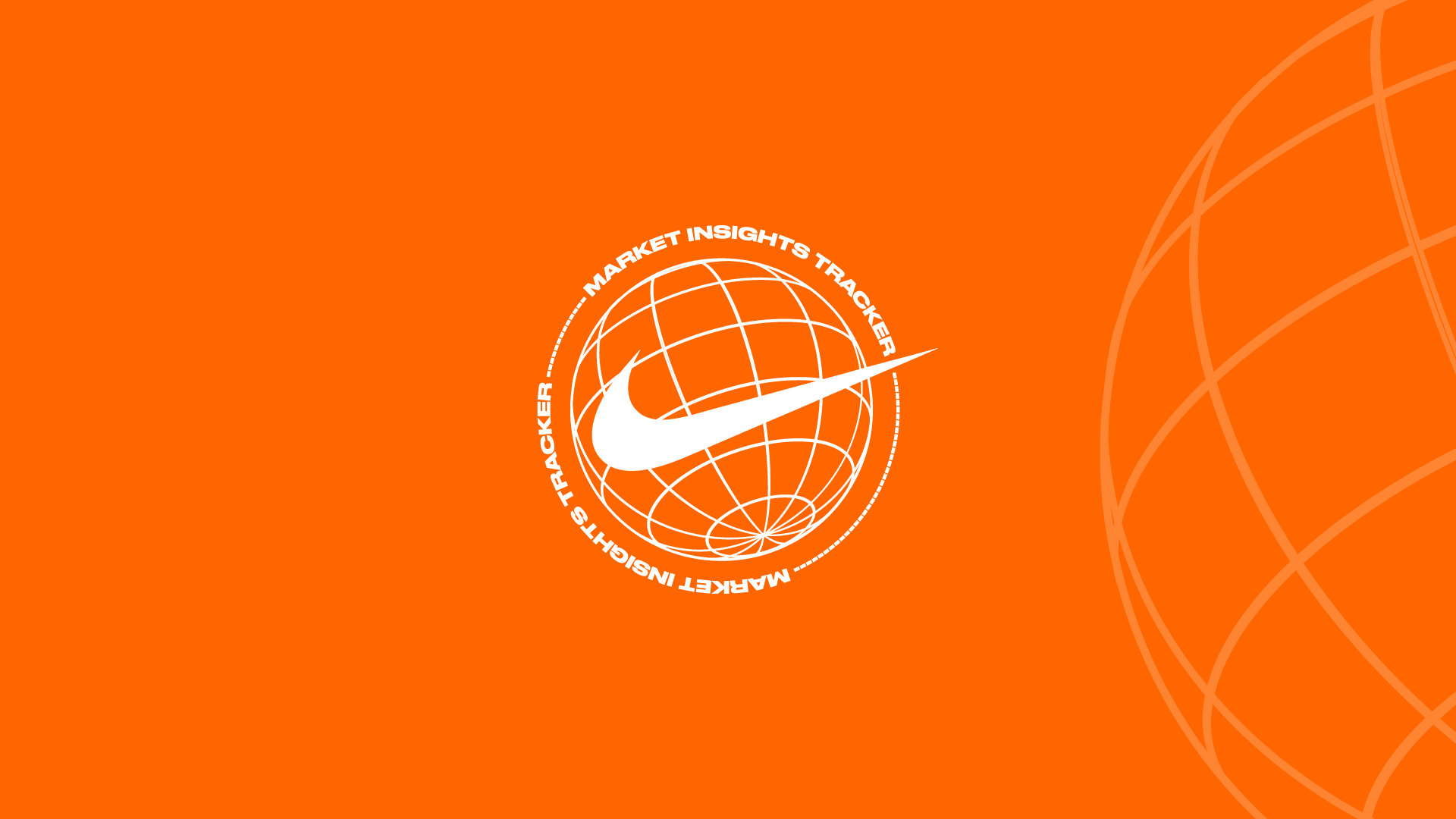
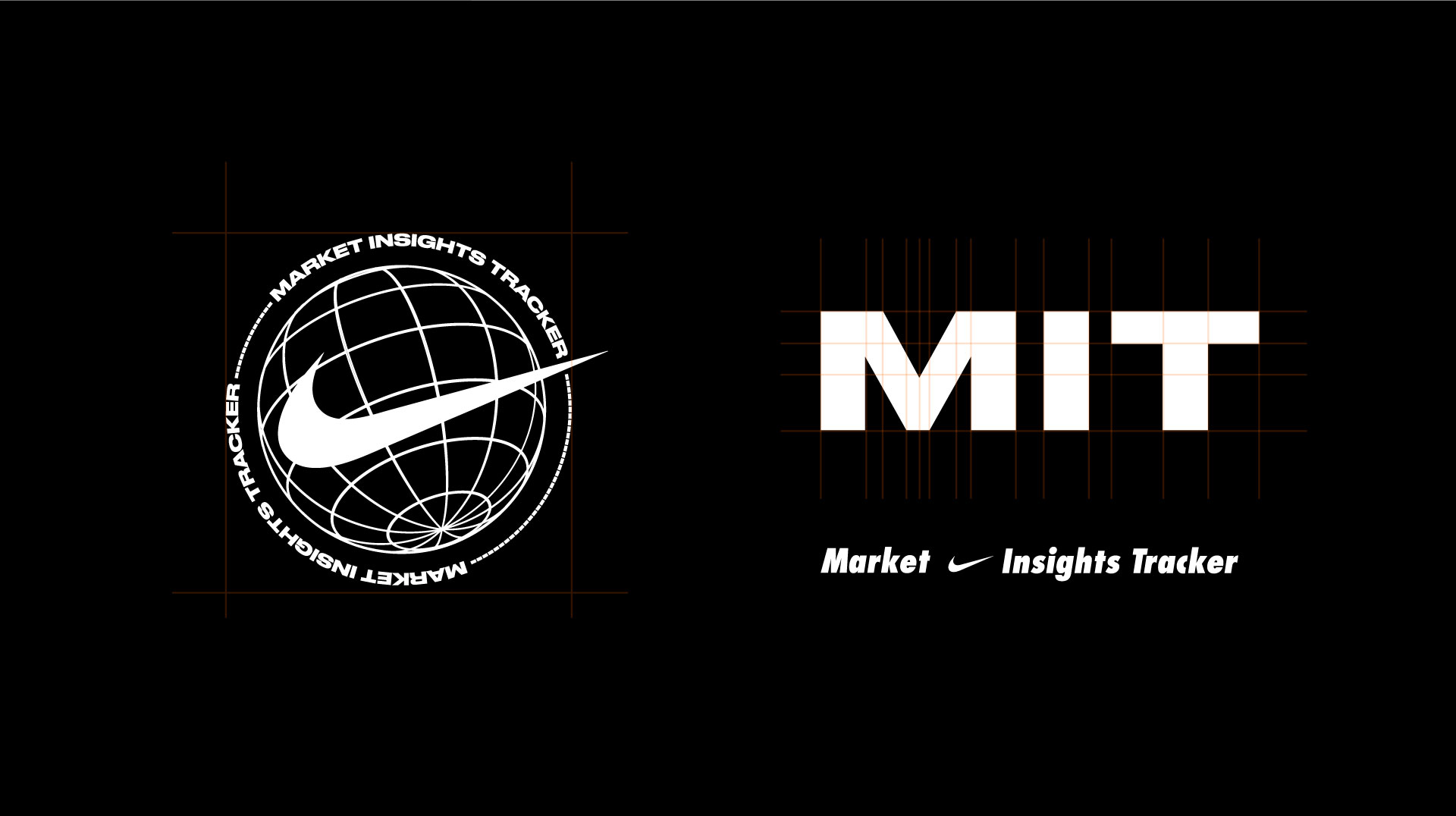
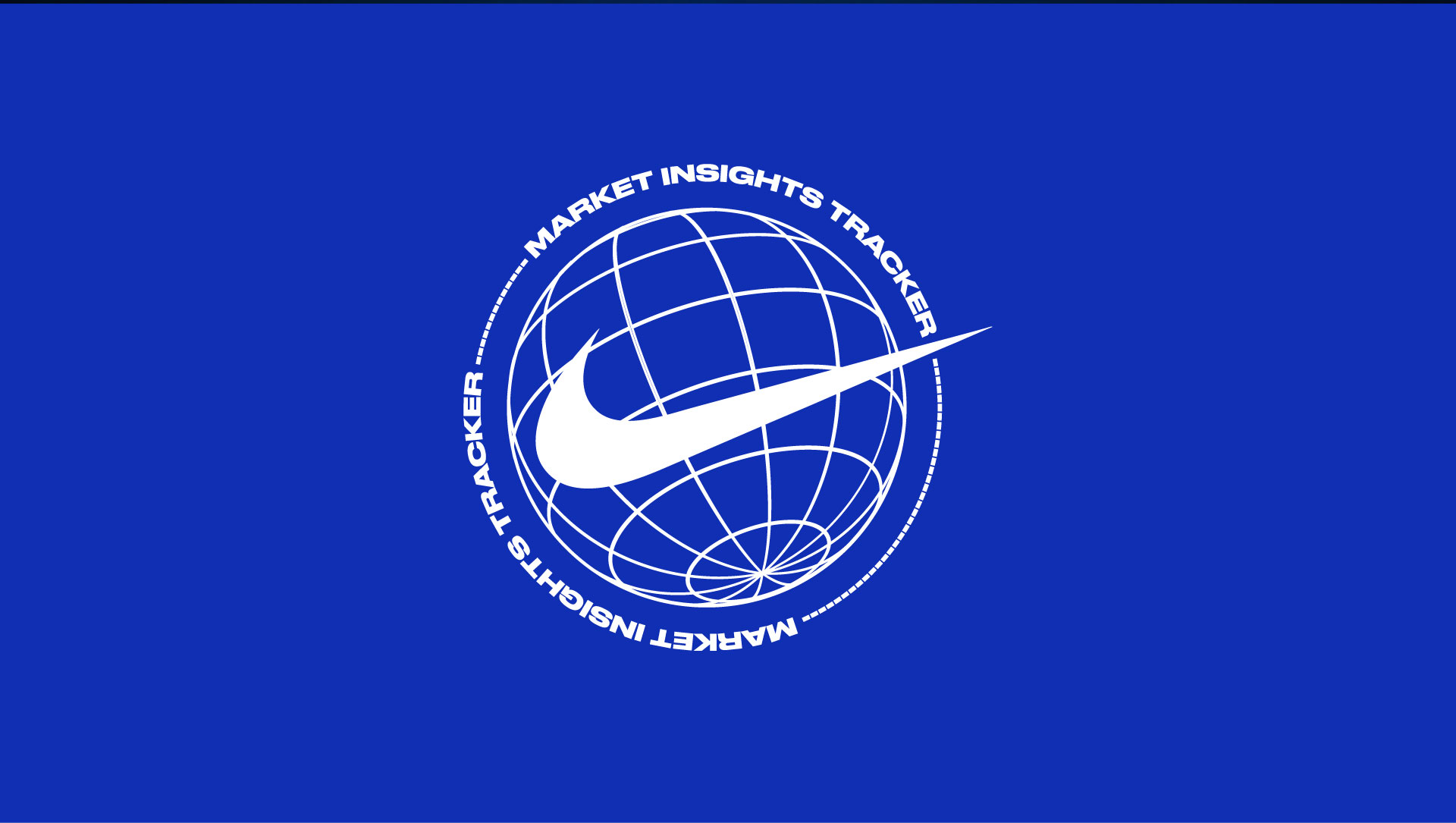
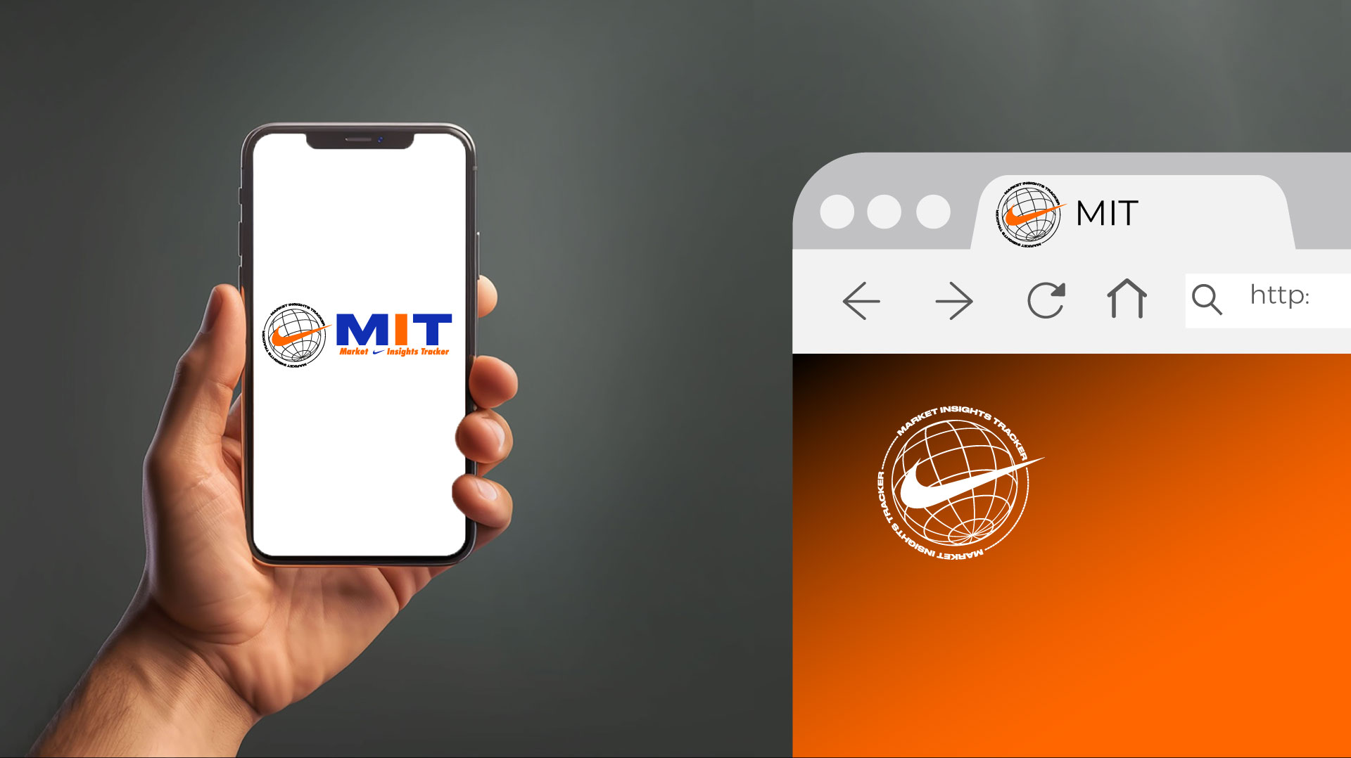
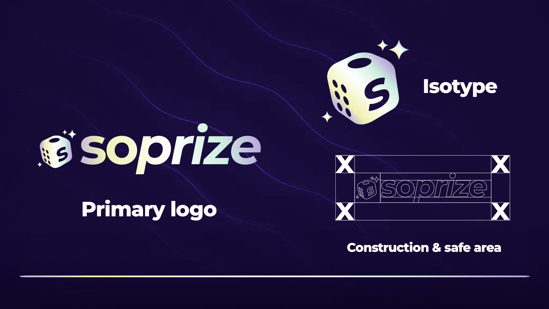
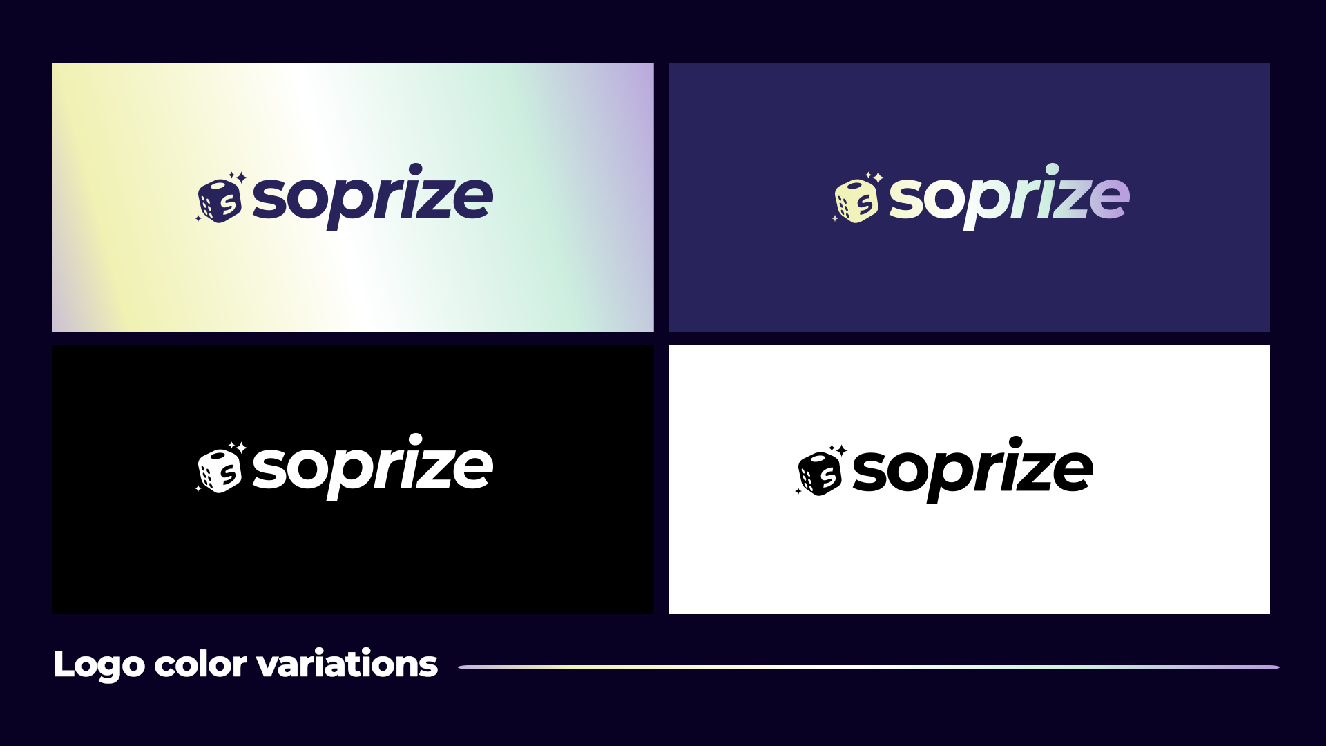
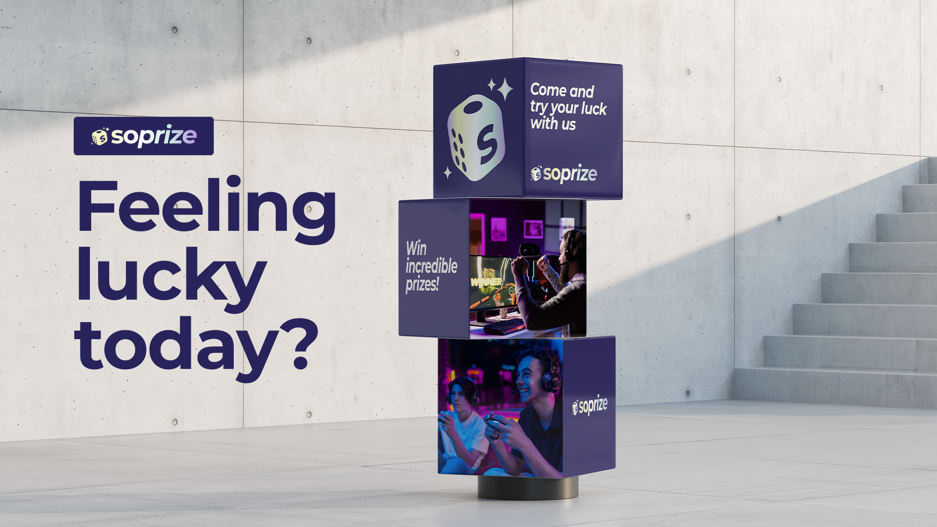
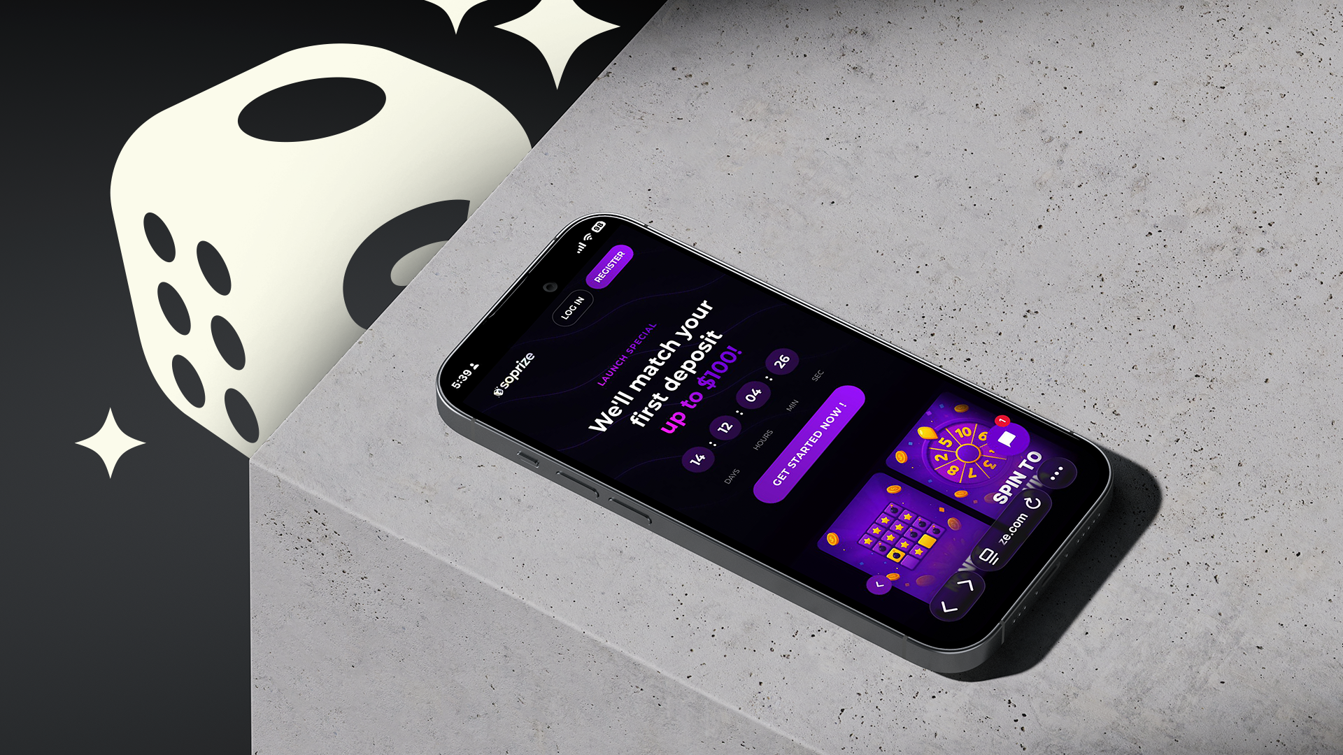
The identity is anchored by a logo that balances geometric precision with the kinetic energy of a reward. A minimalist icon designed for the digital economy. It is optimized for high speed recognition, functioning as a clear visual anchor in mobile interfaces and notification heavy environments. Structural Harmony: The mark represents the exact moment of discovery, the unboxing, using clean lines that ensure legibility at any scale, from app icons to large format digital displays. 
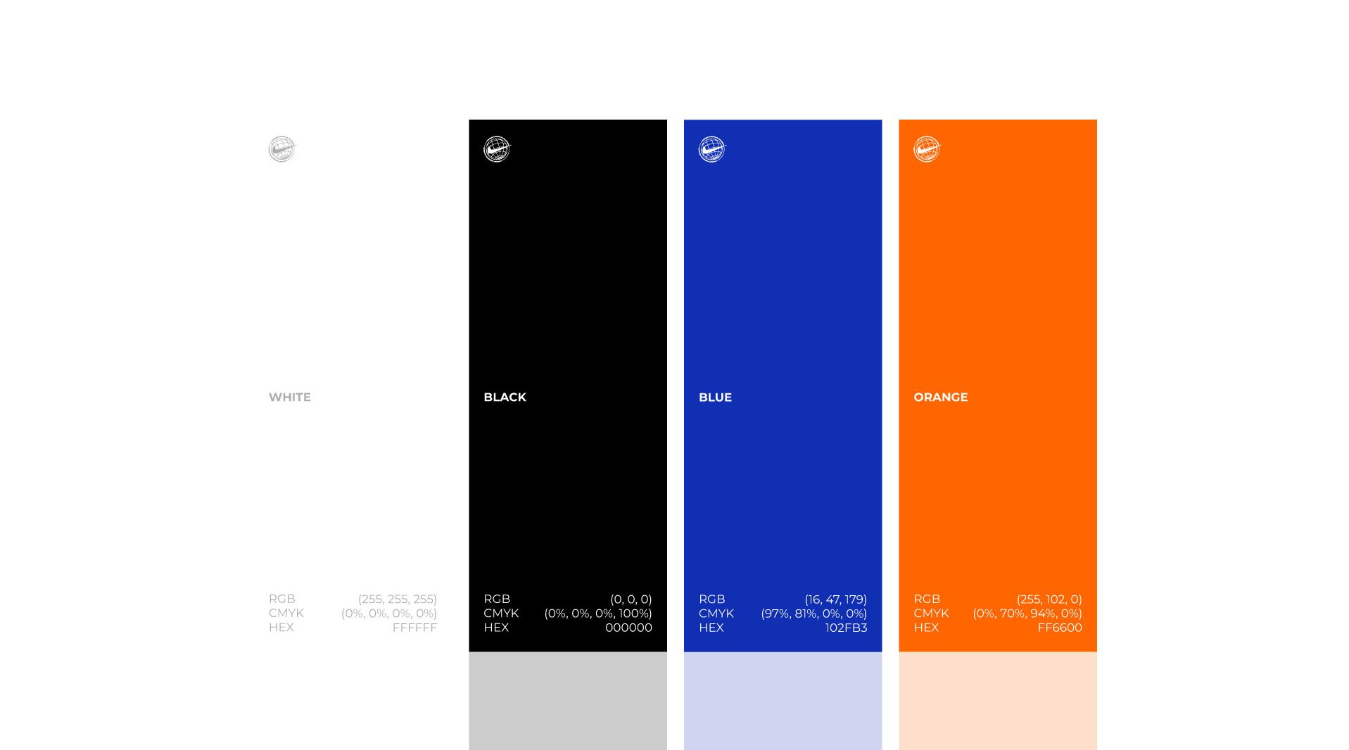
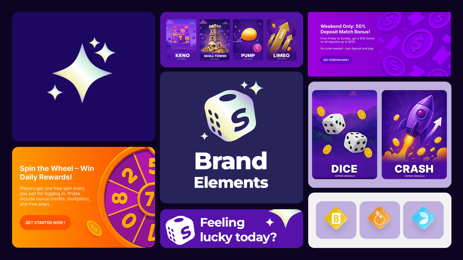
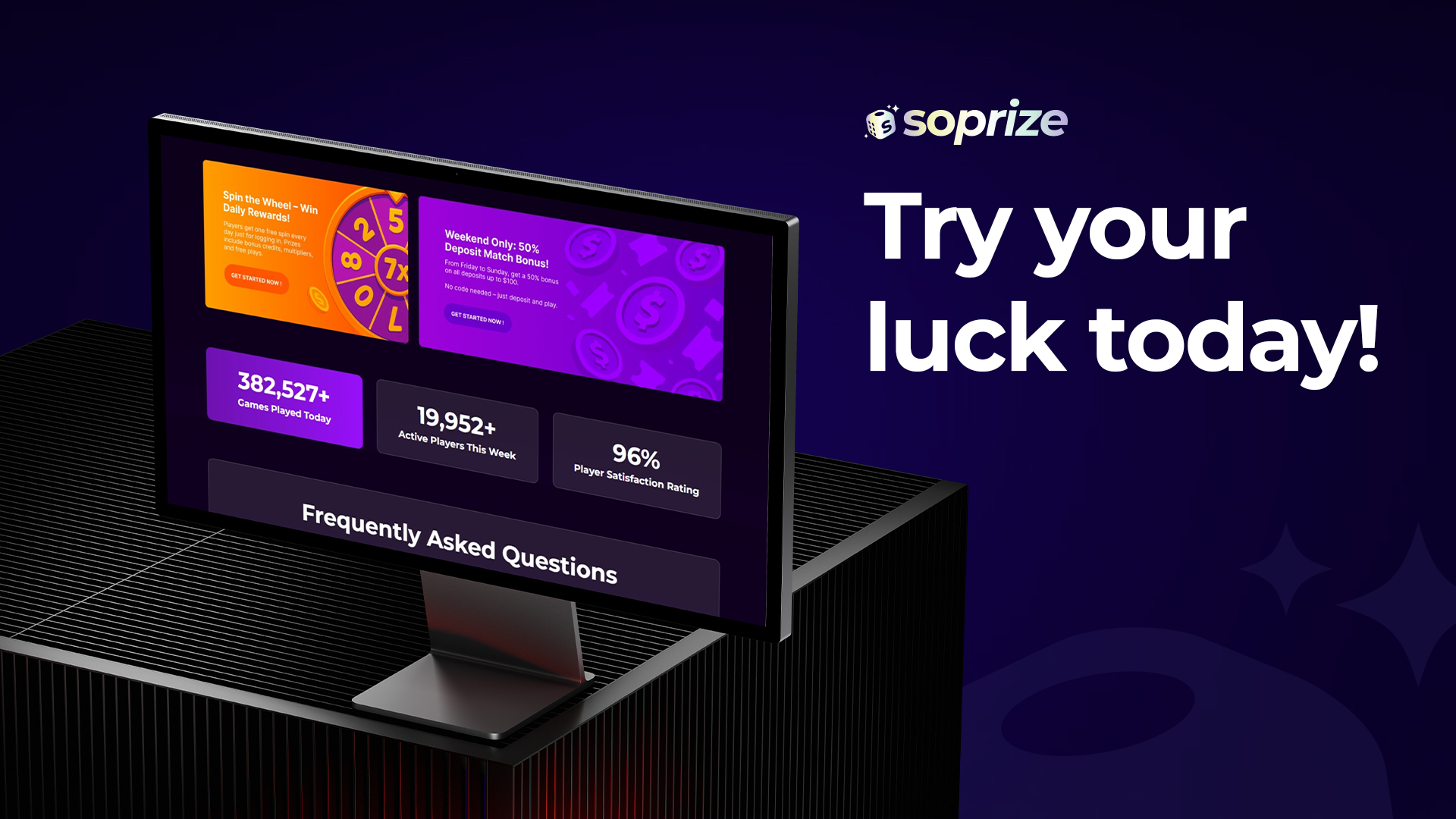
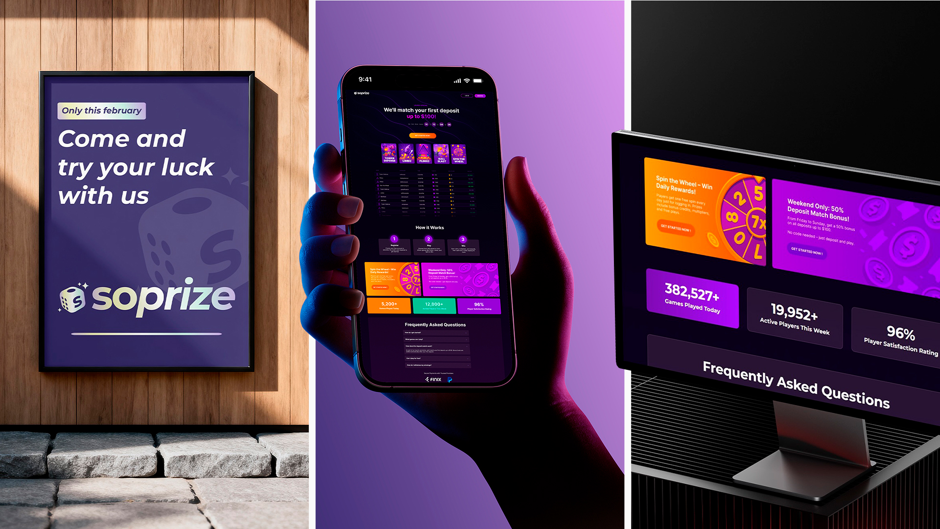
Chromatic Dynamics & Typography: Because Soprize operates in the competitive landscape of digital rewards, the visual toolkit was designed to command attention through high impact contrast. 
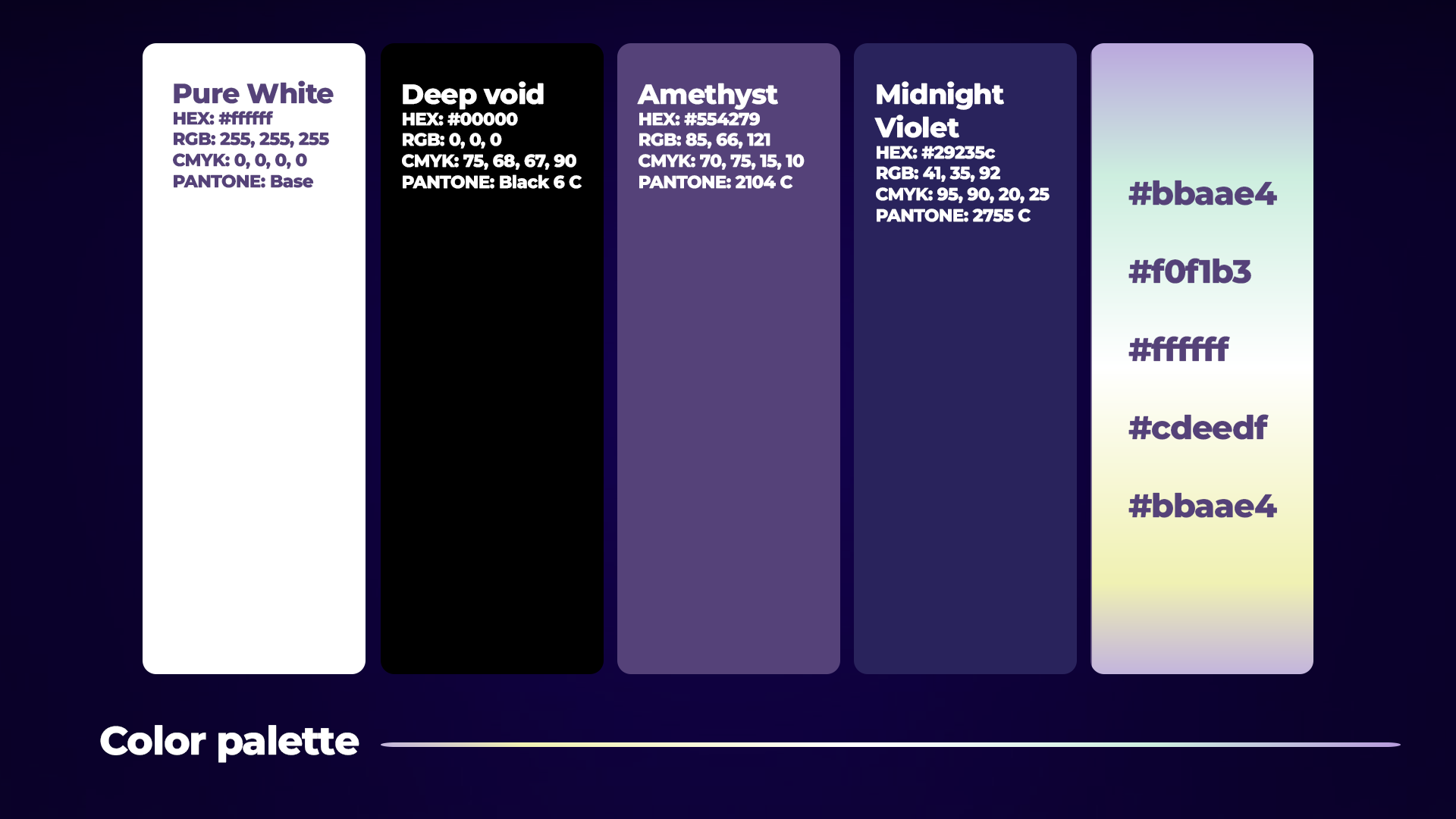
Color Strategy: We moved away from traditional tech palettes to embrace a high energy chromatic system. These colors were selected for their ability to trigger an immediate psychological association with the win, providing a visual shortcut to the feeling of a reward. 
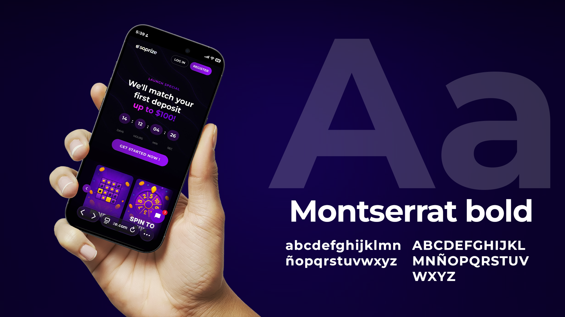
Typographic Voice: The selected typefaces bridge the gap between technical reliability and human approachability. This ensures that every communication, regardless of the platform, maintains a clear, authoritative, yet inviting tone.

The Outcome

Our intervention focused on delivering a robust Brand DNA. We created a comprehensive set of rules and assets that define how the brand lives and breathes. While the digital product continues to evolve through various implementations, the visual foundation established by Ciao provides the necessary consistency and aesthetic rigor to ensure the brand remains recognizable, cohesive, and premium across all future touchpoints. While the platform continues to evolve, the visual DNA we established provides the consistency and emotional resonance needed to turn a simple prize into a true surprise.

More projects

Soprize

Brand Identity, Art Direction, Brand Development, Motion Design